BTR Nation: Visual Design for a Fast-Growing US Wellness Brand
Not every project starts with a blank canvas. Some of the most demanding creative work happens inside an existing brand
Branding
Digital
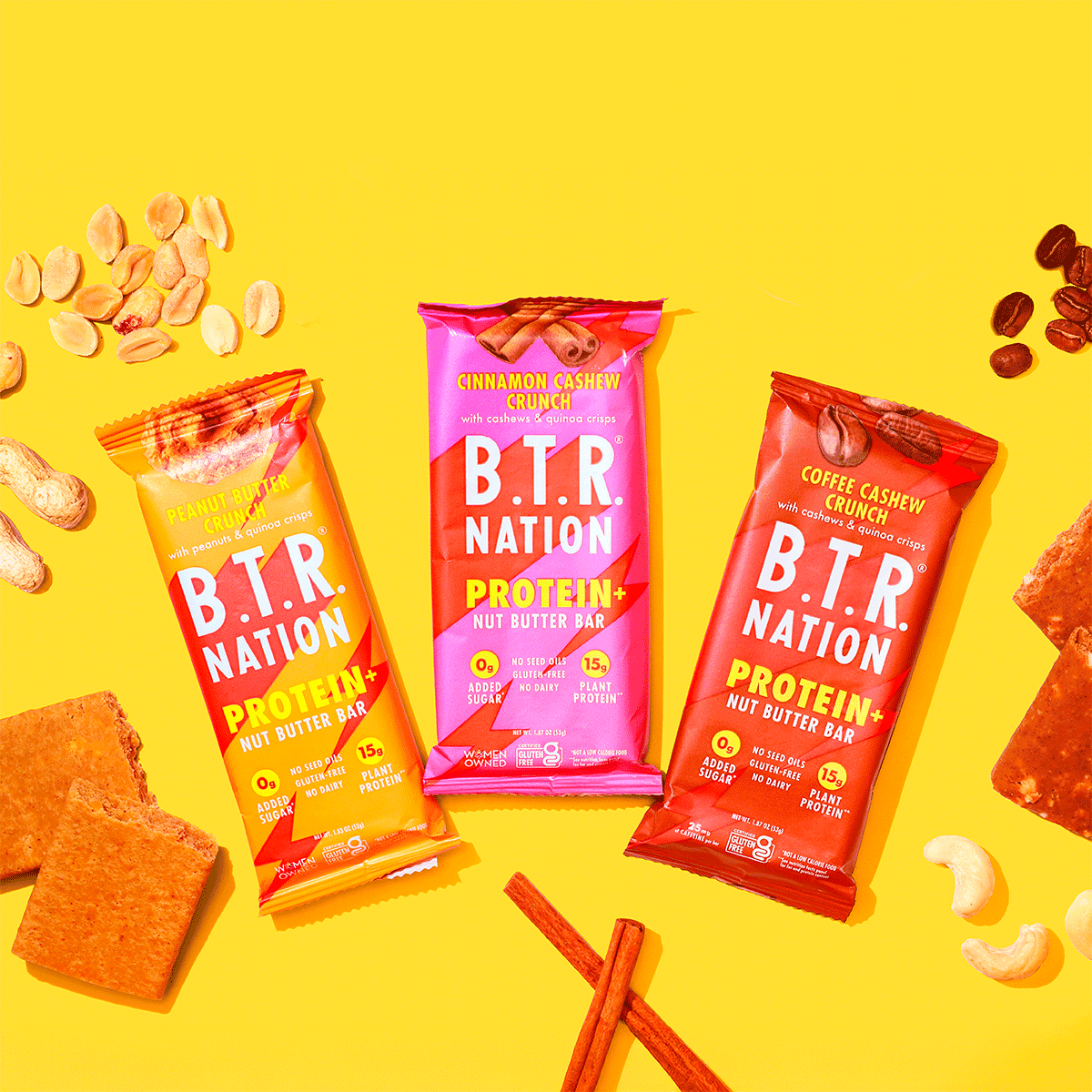
BTR Nation makes superfood snacks with a clear mission: fix a broken food system, one snack at a time. Founded after a deeply personal story of loss, the brand carries emotional weight that has to show up in every visual — not just in the copy. They've been featured in Forbes, the New York Times, and Good Housekeeping, and their products sit on shelves at Whole Foods and Erewhon. The bar for visual quality is high.
The Work
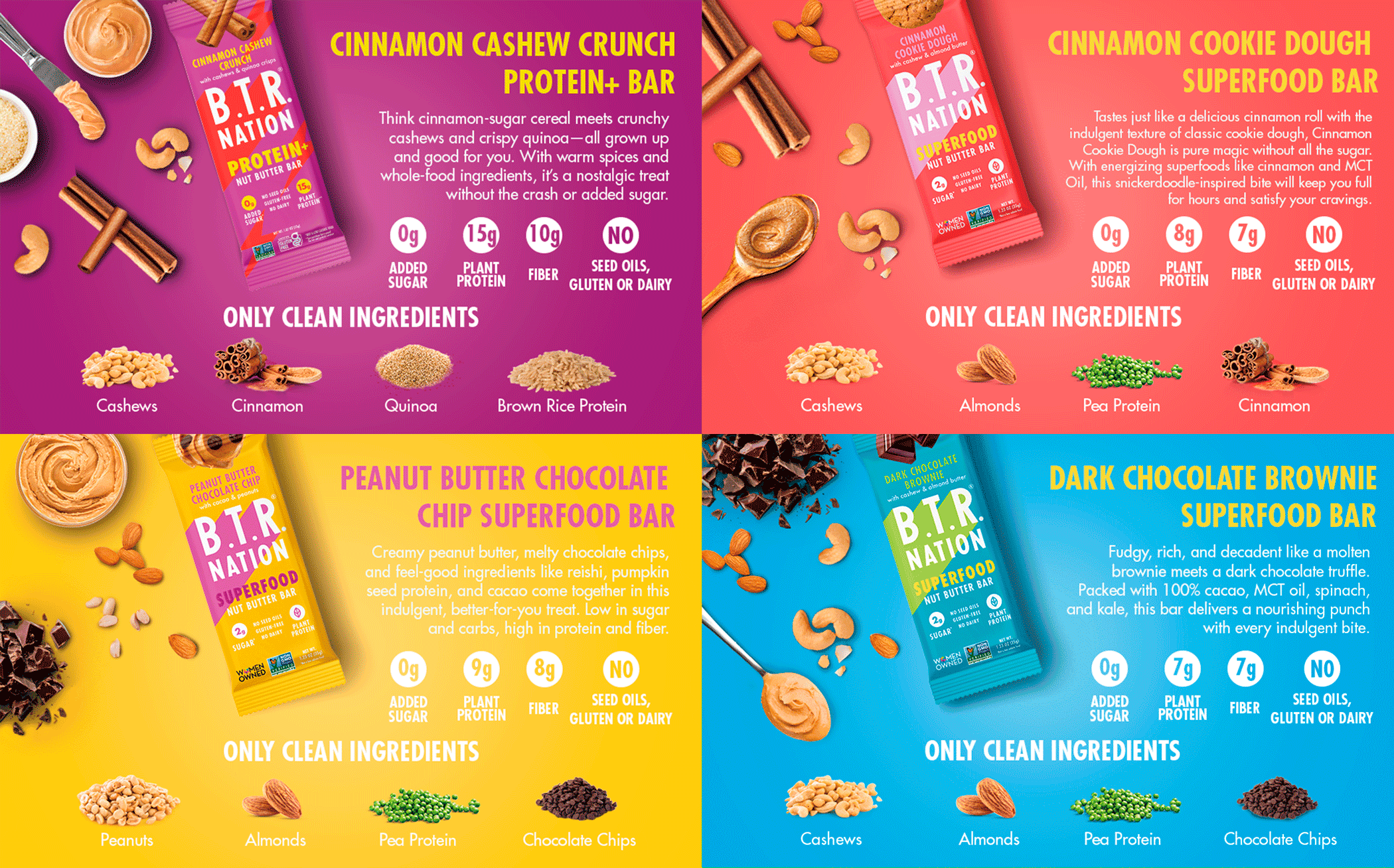
I work with BTR Nation on an ongoing basis, producing a range of digital assets across multiple touchpoints for their US market: product lifestyle compositions, Amazon storefront banners and headers, social media graphics, and promotional visuals.
Amazon work in particular demands a specific discipline — every image has to convert. The storefront is often a customer's first real interaction with a brand beyond a search result, and the difference between a professionally designed header and a generic one is measurable in sales. Lifestyle compositions have to feel aspirational without feeling dishonest, and promotional graphics have to communicate hierarchy and urgency without sacrificing brand feel.
Across all formats, the challenge is the same: make every asset feel like it belongs to the same brand, regardless of where it shows up or what it needs to say.
The Result
A consistent, commercially-focused visual presence across BTR Nation's digital ecosystem — built to support a brand that was growing fast and needed creative output that could keep up.
