Festival: Redesigning an Icon Without Breaking It
Some brands everyone knows. Festival is one of them.
Packaging
Packaging
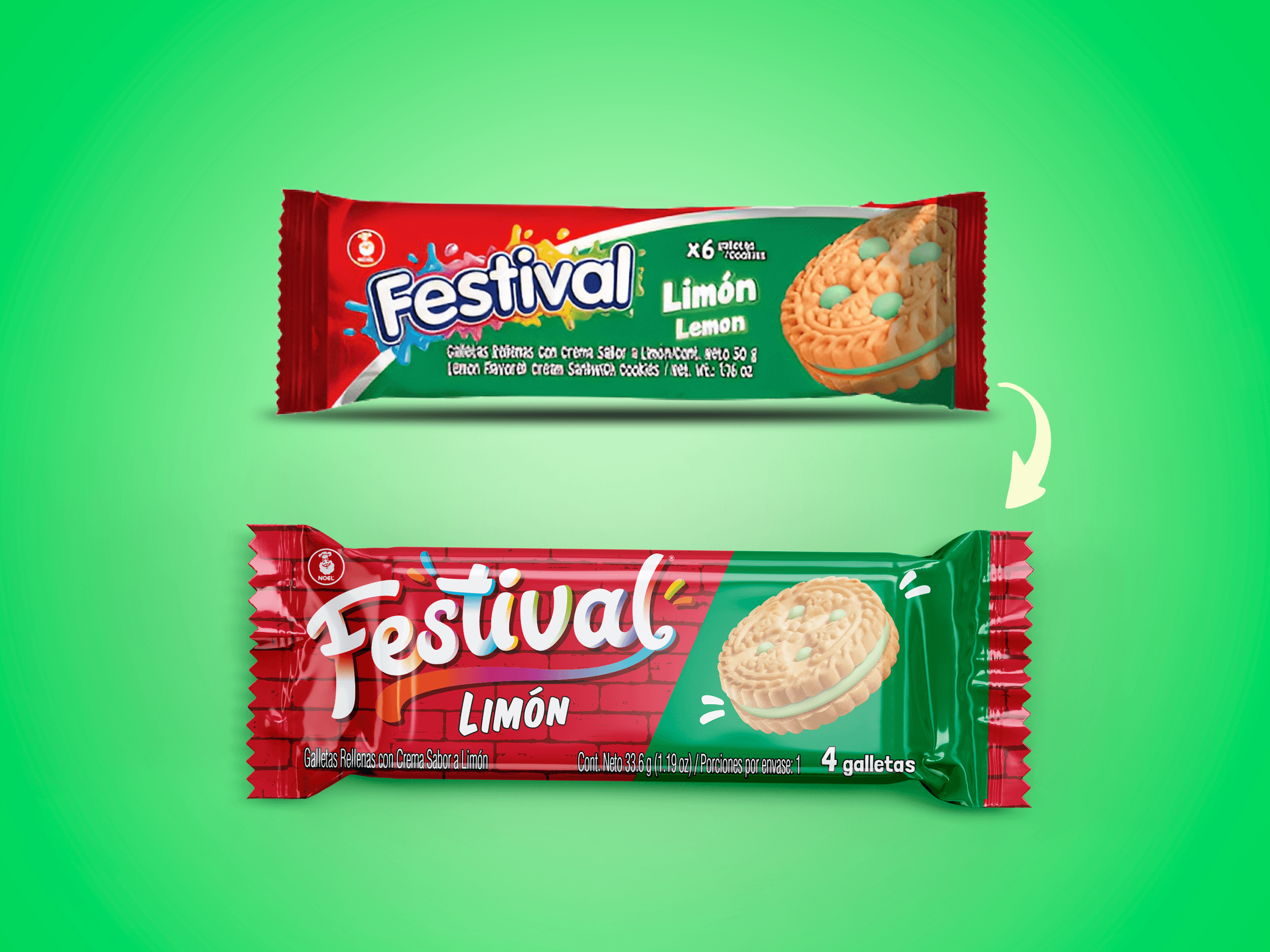
Since 1955, Festival cookies have been part of everyday Colombian life — in lunchboxes, on family tables, in corner stores passed down through generations. But by 2021, that long history had also become a burden: younger audiences found the packaging outdated, childish, out of step with who they were now.
The brand needed to evolve. The question was how to do it without losing the people who had loved it their whole lives.
The Challenge
Redesigning a 66-year-old brand is nothing like designing a new one. Every decision carries history — colors that generations associate with the product, shapes the eye recognizes before reading the name. Change too little and the problem remains. Change too much and you alienate the consumer who built your brand in the first place.
The brief was clear in its ambition and demanding in its balance: connect with a generation that felt ignored by the existing packaging, without abandoning the identity that had earned decades of trust.
The Work
An external agency developed the initial redesign proposal — a radical shift in colors and typography that deliberately broke from the previous aesthetic. My role was to take that vision and turn it into a real, working system.
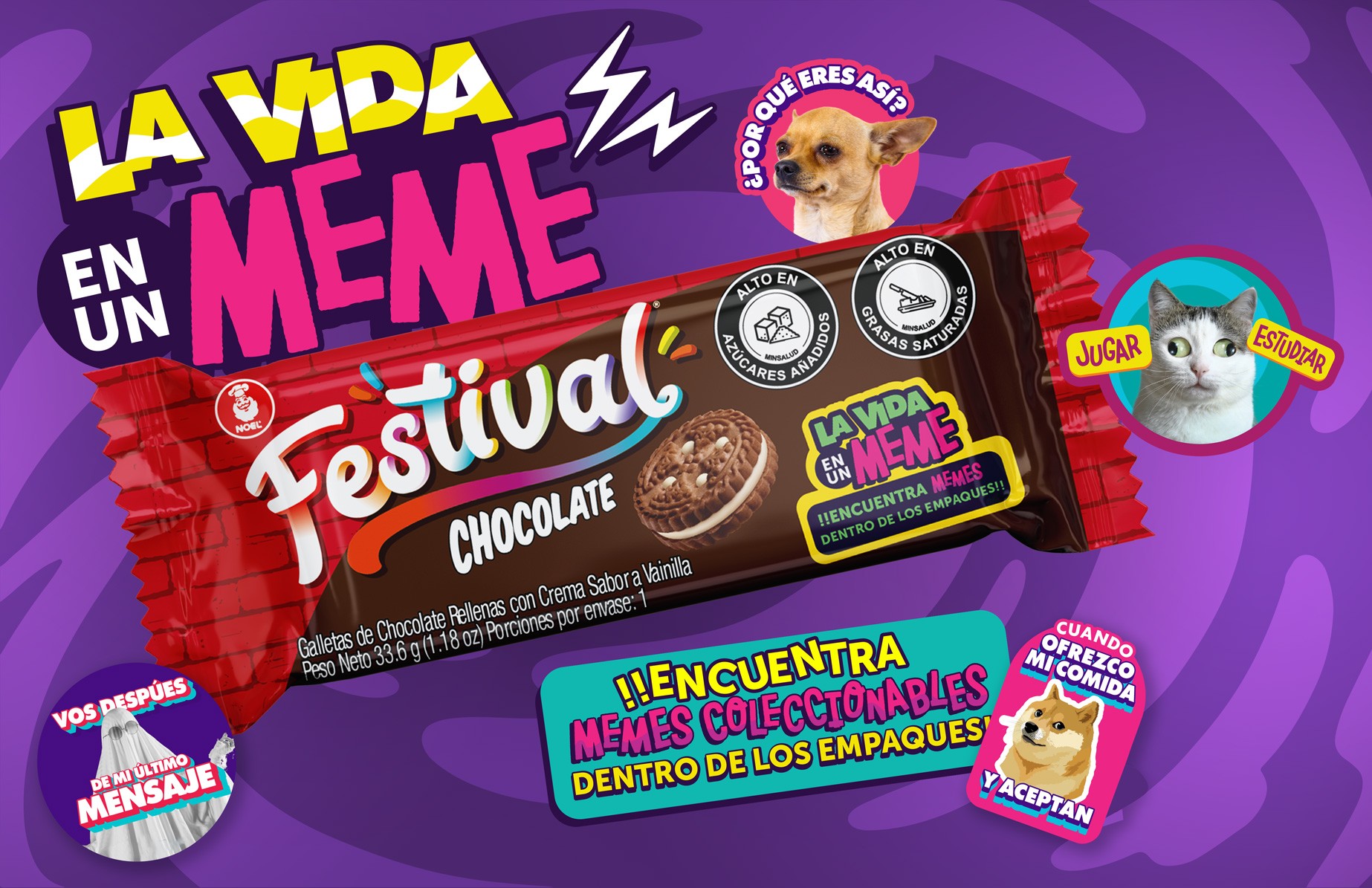
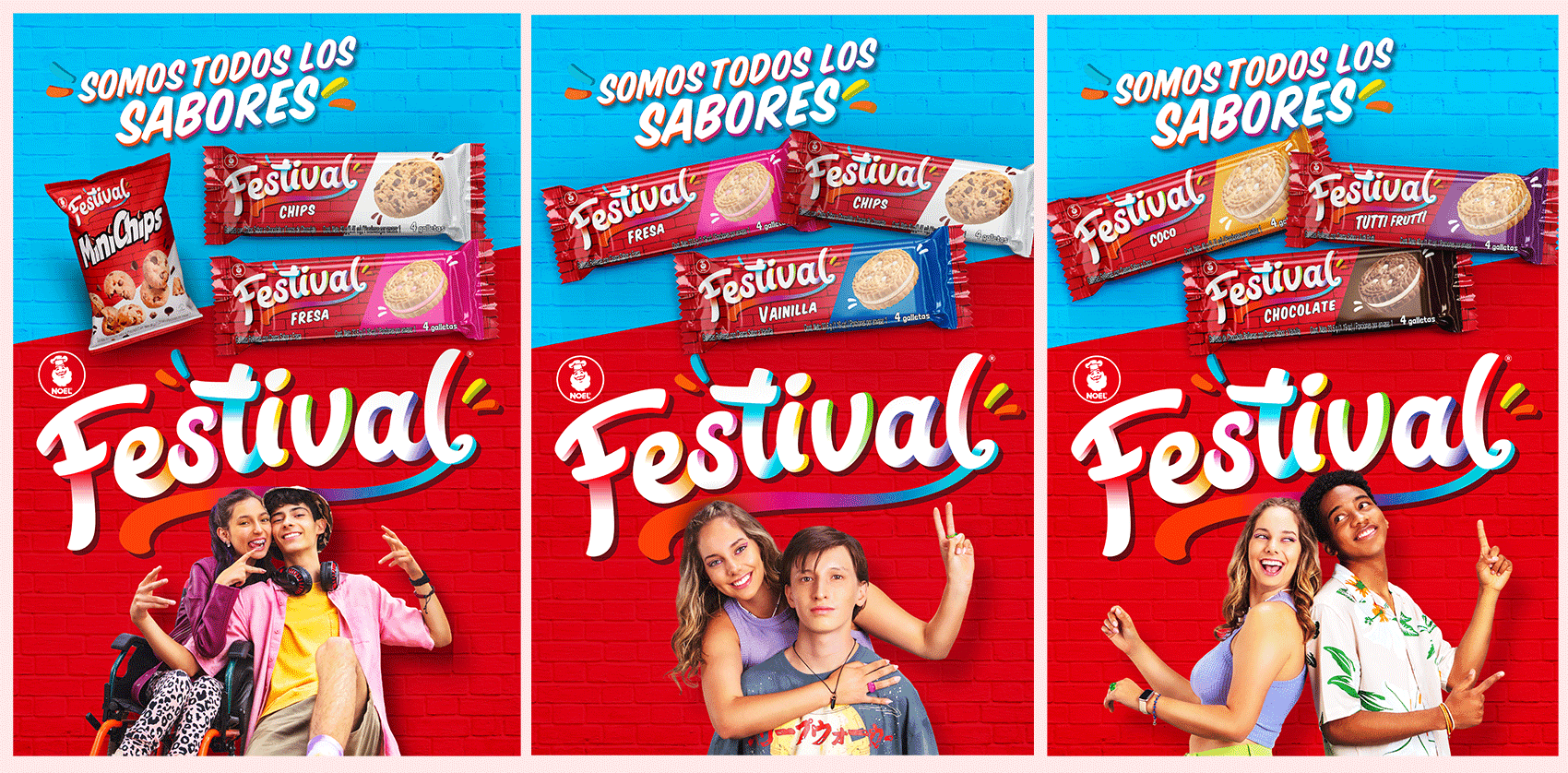
I expanded the redesign across more than 30 SKUs, ensuring the new visual direction held across every variety, format, and size in the portfolio. That's the work that rarely gets the credit but determines whether a redesign actually lives in the world or stays on a presentation slide: making design decisions scale without breaking, without losing coherence, without SKU number 28 looking like it belongs to a different brand.
I also contributed to the development of the initial design itself, helping refine the decisions I would later need to sustain across the entire product line.
The Result
The redesign increased sales by 15% — a meaningful number for a mature brand in a competitive category. More importantly, the audience response validated the bet: the new packaging connected with the generation it set out to reach, without losing the recognition built over nearly seven decades.
For Festival, 2021 wasn't just a visual refresh. It was a new milestone in a story that started in 1955 — and clearly isn't finished yet.